
Whether you’re watching matches or enjoying videos about Scotland’s Tartan Army drinking the city of Boston dry, your TV and/or Instagram feed probably includes some World Cup soccer (or football) right now.
Whatever you call it, Mark Yesilevskiy has illustrated it — for clients like ESPN, FC Buffalo, and the LA Galaxy.
Friday Feature

A marketing agency veteran of more than a decade, Yesilevskiy’s passion for soccer has stretched at least twice that long — long enough to have a tattoo of the Bolton Wanderers’ stadium and strong opinions on 1990s’ kits.
Fever Pitch
That passion is a professional asset.
“With soccer, so much of its identity in most of the world has been around for a very long time. A lot of the English teams, for example, are 100+ years old, whereas some of the MLS teams now are going into their fourth decade.”
Even under tight deadlines, Yesilevskiy respects his audience’s emotional investment. He did a project for ESPN that spanned a couple summers; one summer he illustrated all the World Cup kits, the next, he did the Copa America and UEFA European Championship teams.
With both home and away kits, the entire project required 128 separate illustrations, with only about a month each summer to do the work. Getting one badge color wrong could offend an entire fanbase.
“It taught me a lot about being more efficient with my work,” Yesilevskiy says. He found efficiencies by changing the ways he builds his digital illustrations — and still dedicated plenty of time to getting the kits perfect.
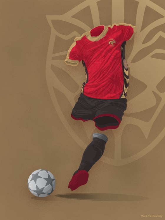
An imagined World Cup away kit for Wakanda / Mark Yesilevskiy
Heated Rivalries
Getting the kits wrong isn’t just an aesthetic failure. Failing to recognize the nuances of soccer’s politics — both regionally and on the world stage — undermines the audience’s trust.
“Soccer as a sport is inherently political. Always has been, always will be,” Yesilevskiy says. “You've got so many different areas in every corner of the world competing against each other.”
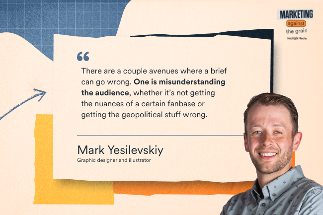
“There are a couple avenues where [a brief] can go wrong,” he says. One is misunderstanding the audience, “whether it’s not getting the nuances of a certain fanbase or getting the geopolitical stuff wrong.”
His advice: Build your topical research into the creative brief before you hire a designer. Nobody wants to be the person who asked for a friendly handshake between Arsenal and Tottenham.
An Open Goal
Branding is tricky when it comes to the most-watched sporting event in the world. You need broad appeal while still being rooted in a place. With the 2026 FIFA World Cup being hosted in 16 cities across three countries, that gets a little tricky — but not impossible.
Yesilevskiy thinks that this year’s FIFA World Cup branding fell a bit short. “Whoever was leading the design, I think either didn't want to offend anyone, or was just playing it safe to appeal to the most people.”
The raw components are already there, he says: “If you look at the actual ball that they're playing with, there are elements from Mexico, United States and Canada.”
Marketers know in their bones that branding has to have a point of view. And optimizing for inoffensiveness is a surefire way to end up with something bland and indistinct. “A lot of the stuff that was considered ugly way back when has very much come back into fashion.”

Arsenal’s 1991 - 93 "Bruised Banana" away kit is one example of "ugly" uniforms coming back into fashion. / Mark Yesilevskiy
Faced with the unenviable decision of being ugly or boring, Yesilevskiy’s choice is unequivocal.
“It's better to be ugly than to be boring. Ugly is memorable.“

Audience Intelligence


.png)
.png)
.png)