
In 2010, clothing giant Gap ditched its classic blue logo for something they found “modern, sexy, and cool.”
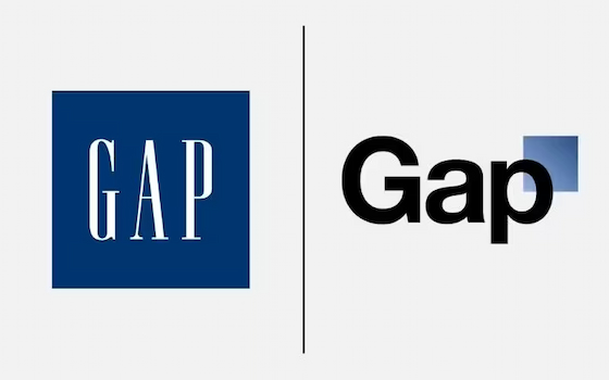
The backlash was so blisteringly unsexy that Gap retreated from the change after only a week.
But I’m not here to analyze that mistake. What I want to know is: How do you get that many people to care so much about a friggin’ blue square?!
To find out what makes a memorable brand, I chatted with the designer who successfully led HubSpot through the risk of a rebrand. And if you’re looking to create a cohesive brand design, his advice might honestly be your best first step.

Getting the brand back together
Daniel Koch sits before a wall of mid-century modern art and a poster from Bowie’s Rainbow Theatre show, chatting effortlessly about artistic principles and design philosophies.
He’s our senior director of Creative, and he led the team that redesigned HubSpot’s entire image. And the reason behind that rebranding is at the core of what makes a memorable brand.
“The way the previous brand was positioned, it had a hyper-energetic color palette that was skewing towards a young audience in feel,” he explains. That bright orange verve was instantly recognizable to anyone in sales and marketing, but it wasn’t sending the right message to their bosses.
“The [challenge] was to not alienate the core customer audience that had grown familiar with this friendly HubSpot brand, but create something that can also appeal to a more upmarket audience with a slightly more sophisticated approach.”
But don’t dismiss this as just ✨vibes and aesthetic.✨
“Demo conversion rate increased by 31%. Email CTR went up 15%. Everything was clearly influenced by the rebrand, because we saw an upswing across every channel.”
The design you create can have real business impact.
Conviction and Constraint
Before we dig into Daniel’s advice for your brand, let’s take a brief look at the high-level steps his team took.
1. Start with conviction, not consensus.
Whether you’re branding or rebranding, the first step is to start with the core ideas that you’re absolutely sure of. Maybe it’s an emotion you want your audience to feel. Maybe it's the image your founder has tattooed on her bicep.
Without this core, Daniel says you’re bound for bland.
“If you launch a brand, you have to have conviction. The two elements we didn’t want to mess with were our logotype, which has been with us from the beginning, and the color orange. Those two elements are so connected with HubSpot. That is brand equity that we want to bring to everything we’re doing.”
This part isn’t beholden to audience surveys or stakeholder input.
“If everyone absolutely loves what you’re doing, then you’re not doing it right. You’re not taking any stand.”
2. Constraints create creativity.
Before creating anything, the first task was to cut away.
“We went from a color palette that was north of 30 colors to a very solid core of nine colors,” and reduced design element shapes from 29 down to only three.
Most people would assume this would give you less flexibility, but Daniel argues that it actually gives you more clarity.
“It’s almost like a combination lock. It might be only four numbers, but there are millions of ways of using them. What actually works is fewer elements used with more conviction. A narrow palette you can commit to and repeat consistently across everything you make. Boldness comes from discipline.”
3. Benchmark outside the industry.
Daniel showed me a slide with four competitor websites. All four featured the exact same shades of blue and white, and nearly identical graphics. You could swap the logos and never know the difference.
“We’re not benchmarking against B2B creative,” he says. That would just create another clone. He invites me to consider a customer who is shopping for a SaaS tool like ours. “This customer doesn’t live in a universe where they’re not seeing any other creative. They’re influenced by ads for Target, or Nike, or Prada. There’s a lot to learn from retail about the emotional aspect of visual storytelling. How do you connect with a customer on an emotional level? Take cues from other industries and how they speak to customers.”
There is a risk to deviating too far from an audience’s expectations, but Daniel says that’s still preferable to being forgotten.
“In a sea of sameness, if you make a bold move, that creates memorability. You have to provoke a reaction first, and then that reaction can be debated.”
4. Widen the stakeholder circle gradually.
Be intentional about who you involve from the outset. Too many stakeholders, and your design will die a death by committee. But not including the right voices at the beginning could lead to unforeseen problems.
“When we developed a new font, for example, that was us and Product working hand-in-hand. We said we need a font that’s going to be expressive, and they’re like, ‘We love that, but we can’t use it in the product because it needs to be legible.’”
Imagine if we’d discovered that mismatch after rolling out a new font across websites, products, emails, etc. Instead, consider who needs to have input from the beginning, and then widen that circle at key inflection points.
5. Build good governance.
“Brand governance is probably the least glamorous part, but also one of the most important.”
If you’re not familiar with the term, brand governance refers to the rules and processes that make sure everyone uses the same colors, fonts, logos, etc. Good governance is why opening an email from Netflix feels spiritually akin to logging in to your streaming account.
“It’s easy to devise something that looks beautiful in [your style guide]. Once [the design] goes to different teams, different people, they need to know how to treat that brand. It’s not just about having central ownership. It’s about getting people to understand the importance of a consistent brand voice across all the channels that you appear in.”
This might look like a usage guide, a slide deck showing all of your elements, a shared folder for assets, hosting live trainings, or being a personal resource for non-design teammates.
“You can set up open office hours once a week or twice a week. People can ask questions about the brand, they can show you artworks, they can show you designs. And you can kind of point them in the right direction.”
Without these resources, even the most memorable design will start to drift from the moment it leaves the design team.
Being On Brand
It’s hard to distill a lifetime of artistic integrity into one five-minute read, but Daniel shared with me the most important tips for making a unified and memorable brand.
Start with fundamentals, not inspo.
When most people start a design project, the first thing they do is go looking for examples of inspiration. Daniel says this is a mistake.
“We’re so overwhelmed with Pinterest and Instagram. It’s easy to look at something and say, ‘I like that’ — but you don’t necessarily know what it is about it that you like.”
Instead, he recommends you spark your creative flow by learning a few of the basic design principles. Believe it or not, this is a great use case for AI. Instead of asking Claude or ChatGPT to make a design for you, ask them to break down the design fundamentals that underpin existing successful designs.
Not sure where to start? “What core elements are going to represent your brand? The color. The logotype. The typography. Photography. And illustration.”
Do the thumb test.
Daniel points out that when people set out to create a brand, they often rush straight to the logo.
“The logo is really important. But recognizability isn’t just about the logo. It’s about the system around it. It’s the color, the type, the composition, tone, and even the copy.”
Find an ad from a world-famous brand and cover the logo with your thumb. Chances are, you can still tell what brand it belongs to. Can you say the same for your brand?
You can’t test your way to a vibe.
“You can’t test yourself to a good brand. No brand has ever done that. Launching a brand is more a gut feeling rather than testing and following metrics. Otherwise you’re chasing averages.”
And if you chase averages, that’s all you’ll ever be.
Which isn’t to say there’s no room for feedback. Which is why the next tip is…
Get feedback from outside your industry.
The key is that you’re looking for impressions, not advice. The feedback you gather should only be a signpost, not a map.
Daniel says that instead of asking questions like, “Do you like this?” you should be asking, “How does this come across to you?”
You’re looking to see if audiences are accurately receiving the message you’re trying to communicate through your design.
“What you’re thinking might make sense to you, but how people perceive it may not resonate.”
Take one piece off.
“There’s a quote by Coco Chanel, ‘Before you leave the house, look in the mirror and take one thing off.’”
The most recognizable brands in the world tend to also be the simplest in design. Think of McDonald’s or Starbucks: Two colors are all that’s needed to be instantly recognizable around the globe. And you can tell an Apple ad simply by the font alone.
“The mistake I see a lot of teams make is trying to build expressiveness by adding more elements. They think richness equals personality, but more often than not, it tends to just create noise.”
Create a brand book.
“Everything starts with the brand book,” Daniel says. Which makes it a funny way to wrap up an article, but now that you’ve got your brand design complete, it’s time for the core of your governance.
This is the ultimate reference guide to how your brand should look, sound, and feel.
“Be really clear on high-level elements. Like, ‘This is our font. Don’t use anything else, unless there’s a very specific reason.’”
A non-exhaustive list of things to consider include:
- Rules for how and where your logo can and cannot appear. (For example, the HubSpot logo must be orange, never outlined, and never with gradients or shadows.)
- A color palette with specific color names and hex codes.
- Font names, sizes, and font hierarchies. (What font is used for blog titles? Subheaders? Print ads?)
- Data viz standards. (What color represents you in graphs vs competitors? What are your rounding conventions?)
- Image size standards and file format rules. (What size should an email hero image be?)
- Language “voice and tone” rules. (HubSpot is always friendly, and never punches down.)
In addition to all of these rules and standards, the brand book should also lay out processes like who owns brand decisions, how to get approval or feedback, and where to go with questions.
This part surprises many people who imagine design as a wild artist unbound by convention. But this is the key ingredient in the alchemy that turns art into brand.
“What is it that’s going to create connective tissue around the product? How does it translate into the website? How does it translate into an ad? It starts with the creative team being the brand stewards.”


![Stop wasting homepage traffic [3 big mistakes backed by 10+ years of data]](https://marketingagainstthegrain.com/hubfs/angela-gomez-matg-blog.webp)


![What We Didn’t Do Boosted Our Paid Ad CVR by 11% [Expert Interview]](https://marketingagainstthegrain.com/hubfs/rebecca-hinton-matg-blog.webp)

